plot function in R Programming Language
Table of Content:
High-level plotting commands
High-level plotting functions are designed to generate a complete plot of the data passed as arguments to the function. Where appropriate, axes, labels and titles are automatically generated (unless you request otherwise.) High-level plotting commands always start a new plot, erasing the current plot if necessary.
Usage
plot(x, y, …)
Arguments
| x | the coordinates of points in the plot. Alternatively, a single plotting structure, function or any R object with a plot method can be provided. |
| y | the y coordinates of points in the plot, optional if x is an appropriate structure. |
| … | Arguments to be passed to methods, such as graphical parameters (see par). Many methods will accept the following arguments: |
The most used plotting function in R programming is the plot() function.
It is a generic function, meaning, it has many methods which are called according to the type
of object passed to plot().
In the simplest case, we can pass in a vector and we will get a scatter plot of magnitude vs index. But generally, we pass in two vectors and a scatter plot of these points are plotted.
For example, the command plot(c(1,2),c(3,5)) would plot the
points (1,3) and (2,5).
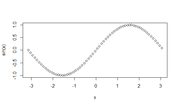
Here is a more concrete example where we plot a sine function form range
-pi to pi.
x <- seq(-pi,pi,0.1)
plot(x, sin(x))
Output:
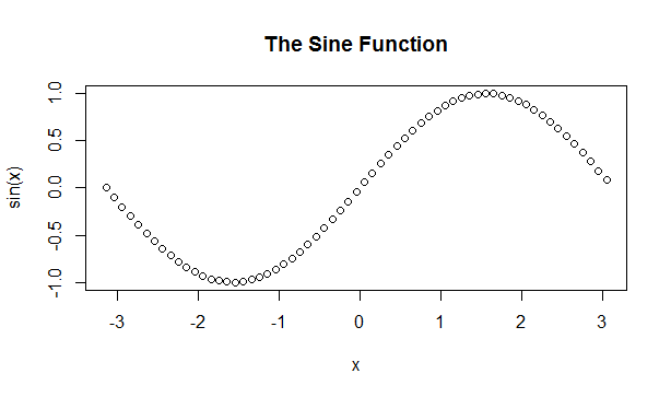
Adding Titles and Labeling Axes
We can add a title to our plot with the parameter main. Similarly, xlab
and ylab can be used to label the x-axis and y-axis respectively.
plot(x, sin(x),
main="The Sine Function",
ylab="sin(x)")
Output:
Changing Color and Plot Type
We can see above that the plot is of circular points and black in color. This is the default color.
We can change the plot type with the argument type. It accepts
the following strings and has the given effect.
plot(x, sin(x),
main="The Sine Function",
ylab="sin(x)")
Output:
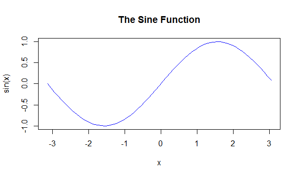
"p" - points
"l" - lines
"b" - both points and lines
"c" - empty points joined by lines
"o" - overplotted points and lines
"s" and "S" - stair steps
"h" - histogram-like vertical lines
"n" - does not produce any points or lines
Similarly, we can define the color using col.
plot(x, sin(x),
main="The Sine Function",
ylab="sin(x)")
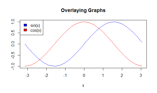
Overlaying Plots Using legend() function
Calling plot() multiple times will have the effect of plotting the current graph on the
same window replacing the previous one.
However, sometimes we wish to overlay the plots in order to compare the results.
This is made possible with the functions lines() and
points() to add lines and points respectively, to the existing plot.
plot(x, sin(x),
main="Overlaying Graphs",
ylab="",
type="l",
col="blue")

lines(x,cos(x), col="red")

legend("topleft",
c("sin(x)","cos(x)"),
fill=c("blue","red")
)
Output: